Easy way to organize your icons using SVGs in Angular 5

If you have too many icons in your project and wants to reuse/customize/use them with different colors or borders and you don`t want to save a million files, probably you will be interested to read more.
Dumb component
First thing that you need to know is that if you want to style a SVG, you definitely need to use its markup, not a link to the .svg file.
Here we have an example of a simple SVG:
If you want to reuse such SVGs you can create a dumb component which will be a placeholder and not include any specific content(graphical objects like path, circle, polygon).
You can see that we have <use> tag, instead of a content. Use tag is used to render not-rendered elements, created for future use (something like templates). These ‘templates’ have ids. So when the id of any element is equal to href attribute of <use>, <use> is replaced with this element.
In our case href is dynamic and it is passed to the svg.component.ts from parent component.
Definitions
Now we have a placeholder, but where is the svg`s content?
SVG`s content is represented by some graphical objects. SVG allows graphical objects to be defined for later reuse. For this purpose we will use <defs> tag. Every object inside <defs> is wrapped in <symbol> and we can think about it as a template. And the most important part is to add id to every symbol. This id should be unique and it is the connection between the placeholder (svg.component) and the definition (svg-definitions.component). All the symbols in the <defs> tag are called SVG definitions. Let see how our file holding definitions looks like:
You probably want to use your SVG icons on different pages, so you need to be sure that definitions are loaded everywhere in the app. To do this we will load svg-definitions.component in the main component.
(app.component.html)
<svg-definitions></svg-definitions>Usage
So we have all the definitions loaded and a shared component for the SVG placeholder. You probably ask yourself how you can use it in the components? It`s really simple. You need to pass the id of the symbol from svg-definitions.component as Input() name to the svg.component and that`s it!
<svg-icon name=”home”></svg-icon>Preview
Nice way to have all your icons in one file, right? But you need to be careful when your project starts growing. At some time you can have too many icons.
What problems may appear:
- it will be hard to orient in the file
- it is possible to have duplicated symbols
- it is possible to have 2 symbols with the same name
- it is possible to have 1 symbol twice with different names
To prevent all these problems, you can create a preview of all the icons that you have using nodejs.
1. Add html for svgs
First we will create a new file svg-converter.js in the /svgs folder. This file will access svg-definitions.component.html and will modify the html:
- create a copy of the svgDefinitions
- remove
<defs></defs>from the copy - replace
<symbol>with<use> - replace
idwithxlink:href=”# - get all the symbols in the array
- get the name for every symbol
- wrap every symbol in
<svg></svg> - join all the symbols back
- append the symbols to the definitions
2. Add styles to the preview
You may want to style your preview, so you can create a svg-preview.css and get the styles from this file in your svg converter.
3. Construct the preview file
The next thing is to construct the preview file. To be sure that you finish reading the html and css files at the same time, you can use Promise.all.
Finally, you need to generate the preview file. To do this run in the /svgs folder:
node svg-converter.js
or add a task to the scripts in package.json:
svg:preview”: “node \”src/ui-library/svgs/svg-converter.js\”
and run in the root of your project: npm run svg:preview
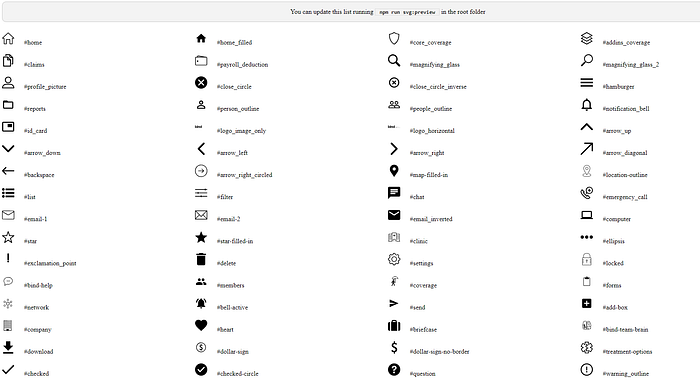
And here it is! The preview of all your icons, which will save you so much time. So are you ready to say bye to the duplicated code?

