Flutter Responsive Apps: Flexible vs Expanded
Which one to use for better responsiveness?
Introduction
Both Expanded and Flexible widgets are widgets to create responsive mobile applications in Flutter. You can read this very basic post(or watch the video) on how Expanded widgets would solve the issue of responsive design in Flutter.
In this post, I am going to talk about Expanded and Flexible widgets and the basic differences between them and when to use them.
How do they work
Both the widgets are tightly coupled with Column or Row (or base Flex) widget. They are allowed to alter the child widget along the main axis of the parent Column or Row widget. For the Column, the main axis is vertical and for the Row, the main axis is horizontal. The cross axis dimension is not altered by either Expanded or Flexible.

Again, for both the widgets, the main purpose is responsive design, i.e., for the Flutter app to change and adapt according to the screen size. These widgets are quite important for responsiveness because, in Flutter, you can’t specify the dimension as a percentage of the screen. For example, the following responsive problem is easily fixed by using Flexible or Expanded.

Flexible
So if you wrap your widget with a Flexible, there are two things that can happen based on the parameter fit.
Loose fit
If you wrap your widget with loose fit, your widget will try to take up the remaining least amount of space available along the main axis.
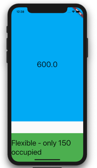
For example if you have a container inside a column with height 600 pixels but the only available space is maybe 250 pixels, the container ends up being 250 pixels.

On the other hand, if our container is 150 pixels but the available space is more than that, the container will be 150 pixels which was assigned to it.
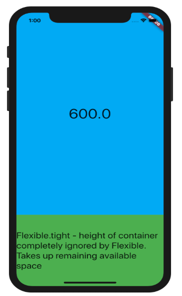
Tight fit
When tight fit is used, the widgets dimension inside the Column or Row along the main axis has no bearing at all.
Let’s take the container example which has height 150 pixels from before which is inside a Column widget. When you wrap the container with a Flexible with a tight fit, the Flexible will ignore the height of the child container altogether and take up whatever space is available, could be 10 pixels, could be 300 pixels, whatever space is left.
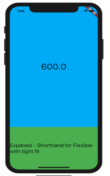
Expanded
Expanded widget is a shorthand for Flexible with tight fit. As simple as that. So our code with Flexible with tight fit would be:
Which one do I use?
If you want to a widget to expand as much available space there is along the main axis inside a Column or Row then use Exapaned but if you feel that you want to let a widget expand along the main axis inside a Column or Row but don’t want it to Expand beyond a certain dimension becuase of legal reasons or maybe for a better customer experience, switch to Flexible with loose fit.
So, thats it, let me know what you think and if they are any other points to add to the analysis.
Happy coding!
Checkout the native app I created using flutter. Currently only deployed to Apple’s App Store. Google’s Play Store is taking more time to review because of Covid delays.
Extras — Youtube Video
Connect with me on twitter:

